Echo
A Video-First Dating Prototype
Role hats:
Product strategy, UX/UI design, research, branding
Timeframe:
2023 (concept project)
TL;DR
Singles were burned out on swipe-based dating. I bet on asynchronous video intros to bring personality back to first impressions. In testing with 30 users, 70% preferred video intros over static profiles, and 70% said it helped them feel a connection faster.
Problem
-
Profiles are flat, conversations fizzle, and meetups often disappoint.
-
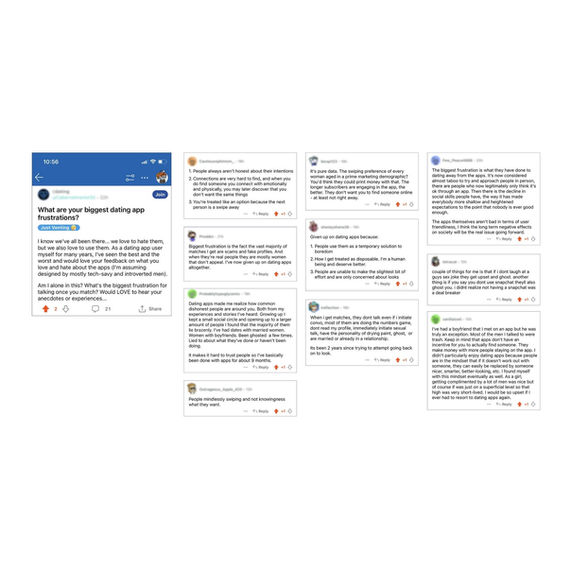
38% of users reported being catfished.
-
75% wanted meaningful connection, yet endless swiping made it feel robotic.
-
Podcast and Reddit threads echoed the same: “These apps dehumanize us. It’s okay to ghost. It’s okay to say inappropriate things.”
Online dating feels like a part-time job.
Business goal:
Explore whether a more human, video-first approach could break the cycle of meaningless connections and improve trust.
Approach
I started with the idea of a feature add-on for existing apps. But after research and interviews, I pivoted to a full end-to-end experience.
-
Richer profile formats (photos, bios, prompts)
-
AI compatibility scores
-
Short, async video intros
I chose #3. Async video carried emotional presence without the pressure of live calls.
Constraints: 30 participants, limited time and resources, safety validation required.
Options explored:
Build
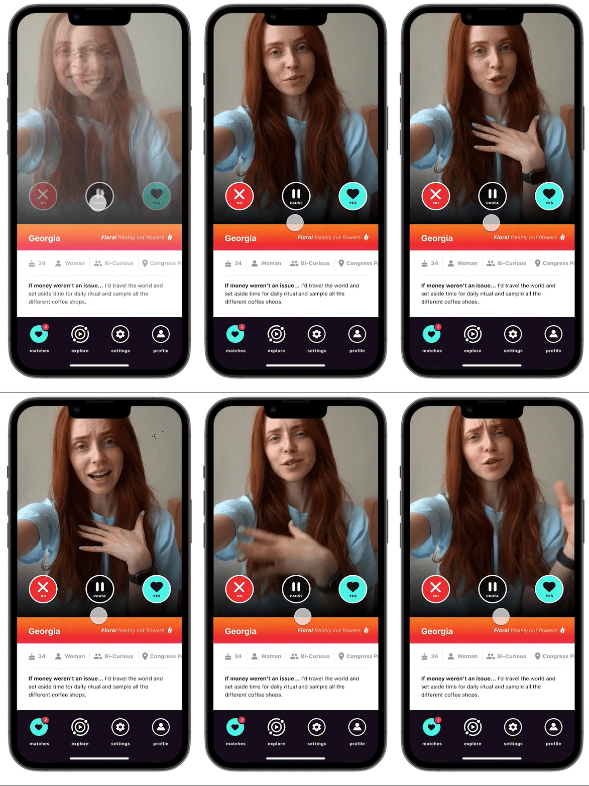
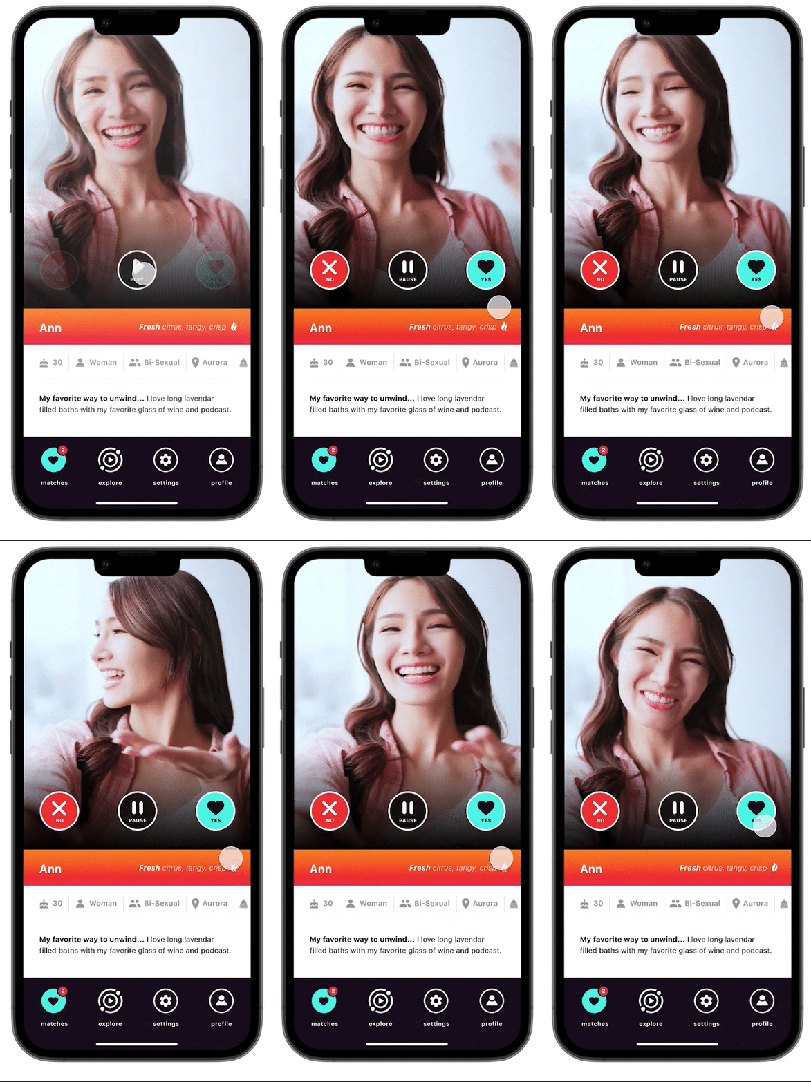
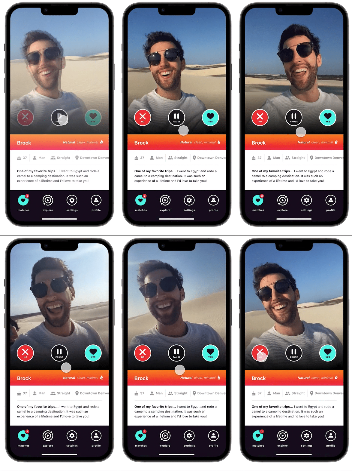
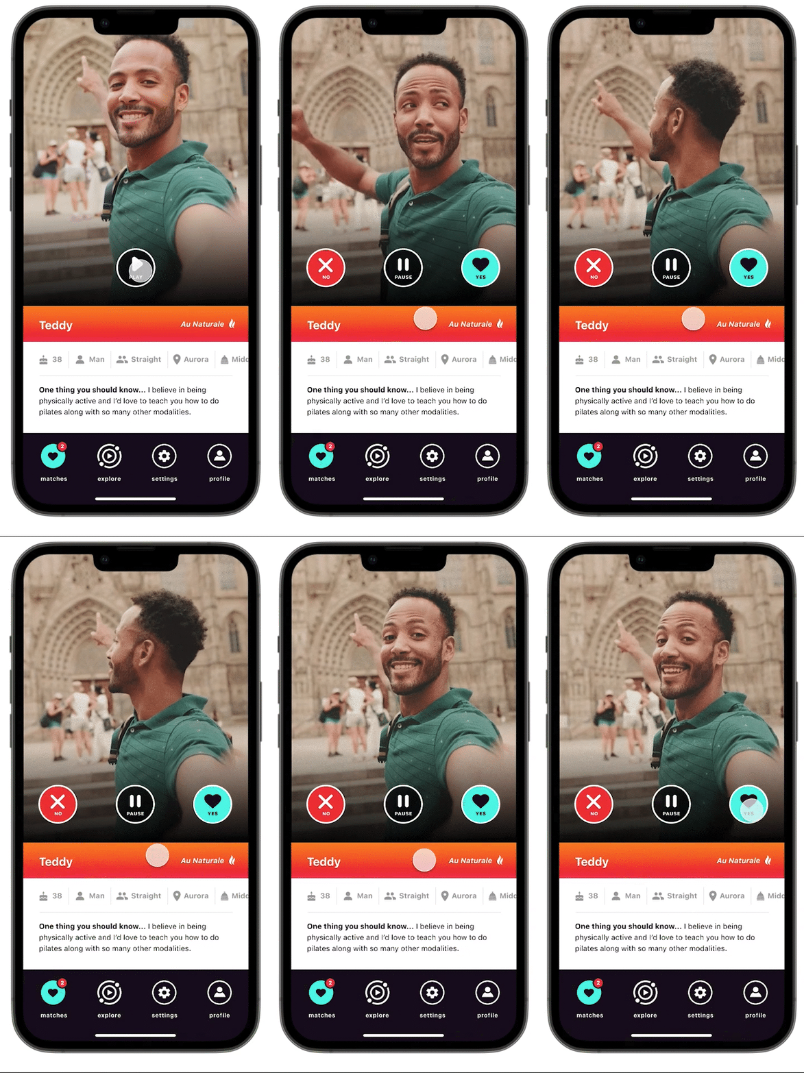
I designed and prototyped the full flow in Figma:
-
Profiles + onboarding (simple setup, editable details)
-
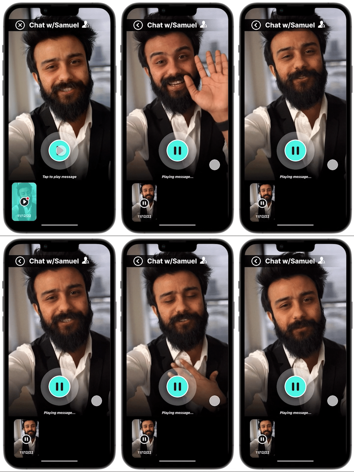
Record and send async videos (with redo option)
-
Prompts like “Show me your Saturday morning vibe” to reduce blank-screen dread
-
Lightweight “Note” feature to share quick updates or meet-up details
UI + Brand decisions:
-
Playful muted gradients, bold video cards
-
Logo: sonar icon + play button, Nimbus Sans Italic
-
Color palette: inspired by TikTok vibrancy, refined for accessibility


Testing & Iterations
I ran five rounds of testing to validate flows, refine tone, and remove friction.
Round 1: Wireframe navigation (5 participants)
-
Goal: confirm flow comprehension.
-
Finding: wanted clearer feedback post-upload.
-
Fix: added progress state + success toast.
Round 2: High-fidelity usability (8 participants)
-
Finding: 60% didn’t understand “X” icon for deleting video drafts.
-
Fix: replaced with trash → confusion dropped to 0%.
-
Language “No new likes yet” felt discouraging → changed to “That’s all for now!”
Round 3: Comfort testing (5 participants)
-
Async video felt 75% less pressured than live calls.
-
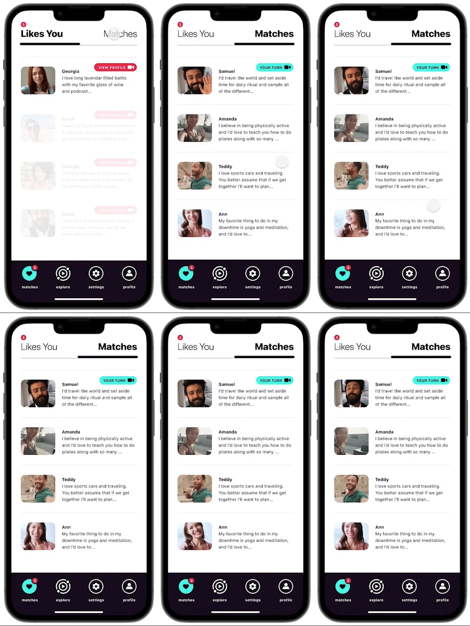
Added timestamps to clarify recency.
Round 4: IA validation (8 participants)
-
90% grouped “View Profile” under “Dashboard/Profile.” Adjusted sitemap accordingly.
Round 5: Visual + copy polish (3 participants)
-
Boosted contrast for readability.
-
Many users wanted to know where a match lived to decide if distance would be an issue.
-
The location field was buried too deep in the sliding bar.
-
I moved it to the 4th position in the details bar for quicker scanning.


Outcomes
-
70% (21 of 30) preferred video intros to static profiles.
-
70% said they “felt connection faster.”
-
80% completed all core flows without moderator help.
-
3 of 5 usability testers described async video as “a middle step between texting and dating IRL.”
-
Prototype validated async video as a bridge between trust and convenience.
-
Opened path for future AI moderation (flagging unsafe content).
What's Next
-
Build a small pilot in React Native to test network effects.
-
Add AI-assisted prompts to help users record natural intros.
-
Layer safety: blur-until-approved, report flow, lightweight location sharing.
-
Explore duet-style replies inspired by TikTok.
Artifacts
For anyone who likes the messy middle — I kept a running design diary that captures my full process: research, full size sketches, and all the thinking that didn’t make it into the polished case study.
