Echo Dating App
Design Diary
MY Role
-
Product Strategist: Guided the project’s pivot from a single feature to a comprehensive app, informed by user research and competitive analysis.
-
UX/UI Designer: Crafted user-centric designs that prioritized ease of use and accessibility.
-
Brand Architect: Designed a cohesive visual identity that aligned with the app’s innovative ethos.
-
UX Researcher: Conducted interviews/usability testing to refine the product vision and roadmap.
Key Deliverables
-
User interviews and persona discovery to identify pain points and opportunities.
-
Task flows, site maps, and wireframes to establish the app’s core architecture.
-
High-fidelity prototypes showcasing the complete user journey.
-
Competitive analysis to validate market positioning and differentiation.
Tools
-
Design: Figma, Illustrator, Photoshop, InDesign
-
Research: UXTweak for card sorting, Zoom for remote interviews
-
Prototyping & Testing: Iterative testing to validate assumptions and refine interactions
My UX Process
Research: Conducted market and user research to understand gaps in current dating app experiences.
Information Architecture: Mapped user journeys to ensure seamless navigation and usability.
Interaction Design: Developed intuitive flows and interactions to enhance user engagement.
Branding: Created a fresh, modern identity that resonated with the target audience.
Prototyping & Iteration: Delivered and refined high-fidelity prototypes through multiple rounds of testing.
Outcomes & Next Steps: Delivered a functional prototype ready for development, with plans to explore monetization models and optimize onboarding flows.

Market Research*
-
323.9 million users worldwide
-
1 in 5 internet users are on online dating app
-
3/4 users want a commitment
-
19% users talk to 11+ people at once
-
42% users aim for marriage
-
13% users got engaged or married
-
Women care about profile info more than men do
-
38% claimed to have been catfished
Podcasts
“We are all humans and are not equipped for the sheer numbers and options of potential matches.”
- GGE Podcast
"The apps have a way of dehumanizing us. It’s okay to ghost and say inappropriate things." - Matthew Hussey
Many singles say that “running” their dating lives feels almost like a part-time job.
Reddit Poll
To investigate further, I wanted to get inside people’s unfiltered comments and experiences, and I found that Reddit was perfect for that.

Summary of findings
After conducting some initial market research, I found similar frustrations regarding messaging and communicating with matches on dating apps.
Users feel trapped in a constant cycle of meaningless connections and endless options.
-
People aren’t honest Their intentions aren’t truthful, and they don’t look like their photos.
-
Meeting in person is a letdown
There is this artificial momentum on the apps, and often meeting in person can be disappointing.
-
It can be mindless because it’s not intentional and it feels robotic.
-
In-active or “fake” users resulting in catfishing and scammers.
-
Endless options and the grass is always greener mentality.
-
It’s exhausting and can feel like a job, with endless “get-to-know-you” conversations.


Insights
Users wanted to stop the back-and-forth messaging and meet IRL, but that contrasts with the overall distrust of users and that the person is who they say they are. There needs to be a middle step between messaging and the date.
Conversations can feel fake and scripted with the use of prompts.
It's a numbers game. Quantity over quality matches.
Our 2-dimensional view of one another leads to dehumanizing.
Video dates can feel like a lot of pressure because it’s awkward, and you must keep a conversation going. It would be so lovely if you could leave a message.
The lack of effort on dating apps is only snowballing.
Wants to feel more of the person's personality show through.
Long conversations lead to significant build-up and disappointment.
User Storyboard

As we can see, Alex is still optimistic in his quest for love. Still, online dating can take even the most enthusiastic person and make them feel worn down and jaded.
A video chat app brings “human-ness” into online dating. With an app, you can use wherever, whenever you have a free moment.
User Persona
After going through and synthesizing all my research and data, I identified the following behavior patterns that make up this user persona.

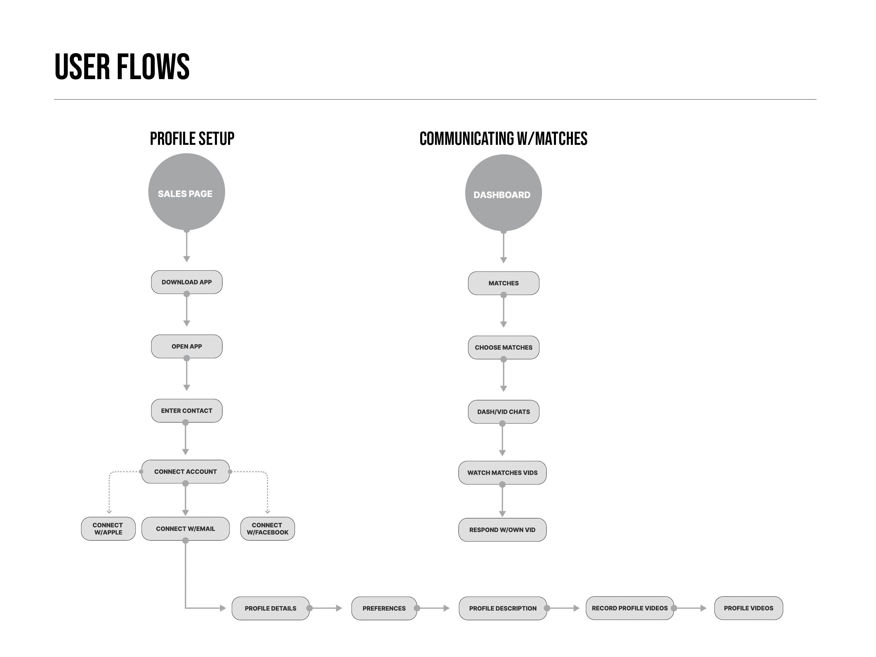
2. Information Architecture
After looking at many different app architectures, I started with a simple pattern allowing users to communicate with matches and update their profile easily.
Site Map

Card Sort
After creating my sitemap, I organized the information in a way I hypothesized would make sense to my users.
I decided to test my decisions with eight respondents using a UXtweak Card Sort exercise.


After analyzing the card sort results through a Standardization grid, I could see any cards placed under specific card categories by most respondents, including any cards placed in multiple categories.
I could see if the respondents would have placed cards differently. For instance, the View Profile card would be located on the dashboard under the Profile card category.


4. Branding
Core Values
I wanted something to capture the vivid connection possible with this app that engages matches online through exchanging video chats.

Name Brainstorm
I used a list of nouns, adjectives, and verbs to see if I could find something short and sweet.
I decided on Echo after loving the versatility of the word and how it gets to the heart of understanding another person. In good communication, a give-and-take is “echoed” by the other person.

Logo Development
I chose Nimbus Sans Bold Italic typeface for its readability and movement.
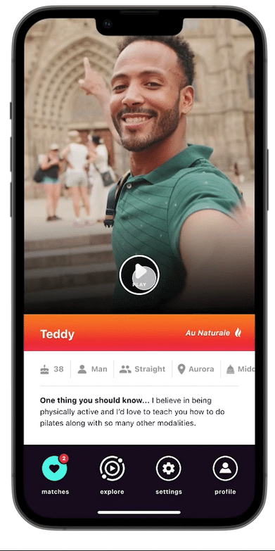
After designing many logos that demonstrated messaging, video, love, etc., I used a “sonar” icon. There are two dots representing two people communicating and a play button in the center - a prominent feature of the app.

5. Prototyping
Colors & Typography
I wanted the colors of this app to reflect vibrancy and dimension. I also brought in the “glitch” style logo to relate to the users of TikTok and other video-focused apps. It should be fun and stand out on the phone’s home-screen. I also used the material design tool helped decide which colors would work well together for the text and buttons.
I chose SF Pro for the font because of it's readability on screen and it's neutral, flexible, sans-serif typeface with plenty of weights.

Sticker Sheet

High Fidelity Prototype

6. Iterations
Icons
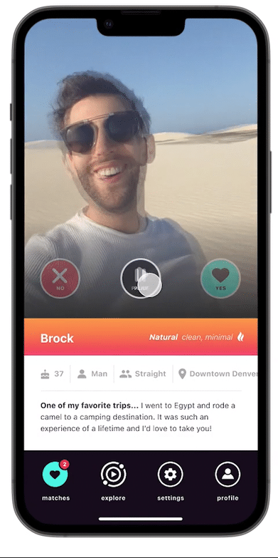
When tasked to respond to one of their matches messages, they can redo their video if they disapprove. I originally had an x to symbolize “not approved,” but I learned from my users that they don’t always know what that icon means. Changing it to the trash icon helped ease their minds because they knew it meant trash.
Before
After
Sending Quick Notes
Because this app focuses on video, I wanted to keep things consistent. The problem with relying on video is when users want to send quick details like their number or location to meet up for a date - that’s harder to do on video. I added a note feature to help address this problem.
Before
After

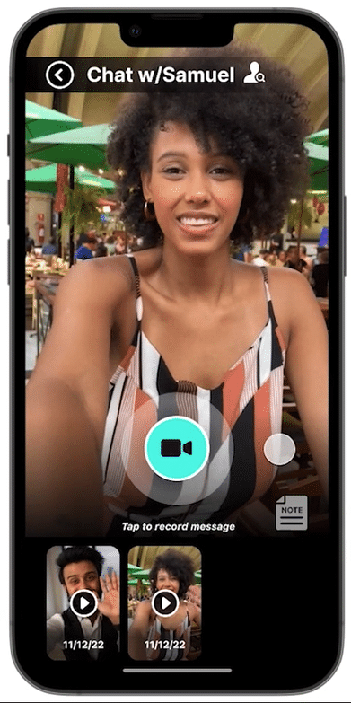
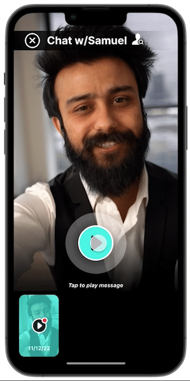
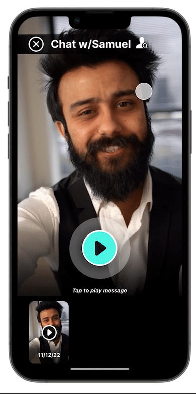
Date Of Message
My users want to know when a video was sent so they can decide when would be an appropriate time to reply. I added a feature to the video thumbnails with the date the video was sent.
Before
After

Matches
Because it will take some time for the system to match people up and then for each user to like each other, I learned that some users feel disappointed with the initial language of “no new likes just yet,” so I wanted to make it more positive by saying “that’s all for now!”
Before

After

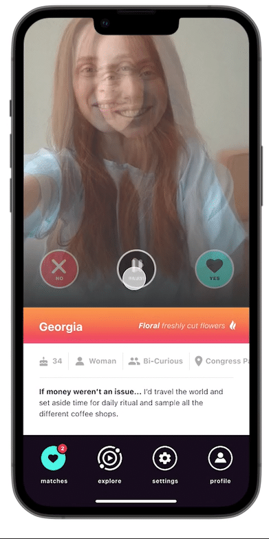
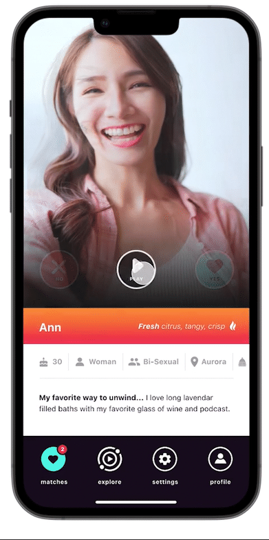
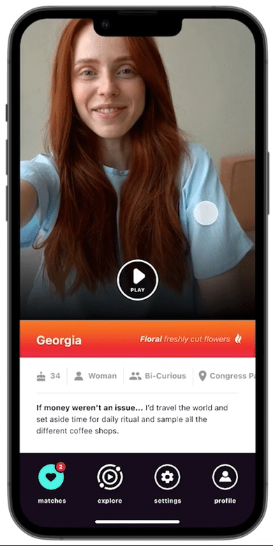
Details Bar
Many users want to know where a match lives to decide if the distance will be a problem. I had initially buried the location a little deeper into the sliding bar. Still, after hearing users’ concerns about their match’s location, I made it the 4th when viewing from left to right.
Before
After

View Profile
When users are inside the video chat feature I wanted to make sure that they could easily get to their match’s profile to see their details at a glance.
Before
After

7. Final Prototype